I've been experimenting with a new way to review financial models using Claude Code, and it's changed how I approach the work. The output is highly visual — every metric becomes an interactive chart with a trendline overlay. Errors and anomalies that would take minutes to find in a spreadsheet are visible immediately. And because the analysis is separated from the model itself, you can produce different cuts quickly and use them to frame a narrative rather than just report numbers.
What the skill does
You run /review-model in your Claude Code terminal and point it at an Excel file. Claude reads the model, maps out the structure, and generates a self-contained dashboard.html you can open in any browser.
The dashboard organises the model into tabs — Revenue Drivers, Income Statement, Balance Sheet, Cash Flow, Trading Comps — with an Annual / Quarterly toggle at the top that switches every chart simultaneously. Each metric is rendered as a Plotly bar chart with a YoY growth rate overlaid as a dotted trendline. You can hover for exact values, zoom into a time range, or isolate a segment by clicking the legend. The Excel file is not modified.
Using an Amazon financial model as the example — 17 sheets, 184 distinct metrics on the Income Statement alone — here is exactly how the pipeline works. You can also open the live Amazon dashboard to follow along.
How it works
Step 1 is the Excel file itself. The Amazon model used here has 17 sheets and around 184 distinct metrics on the Income Statement sheet alone. Time series data runs across columns — quarterly periods from Q1 2022 through Q4 2026E, annual periods from 2020 onwards. Metrics run down rows. That structure is consistent across professional financial models, but the exact coordinates — which row, which column, which sheet — vary per file.
Step 2 is parsing. Claude reads each sheet and identifies the header row. Once the header row is found, it scans across to detect period columns — looking for date-like labels (Q1 '22, 2023, FY2024) and classifying them as quarterly or annual. It then scans down to extract metric names from the row labels. The output is a schema.yaml that records every sheet's header row, its period column coordinates, and the named metrics with their row numbers.
The Amazon schema maps the Revenue Summary sheet's header to row 11, finds 20 quarterly period columns (B through U) and 7 annual columns (W through AC), and records 33 metrics by row. That coordinate map is what makes the next step possible.
Step 3 is extraction. Claude reads each cell value by (sheet, row, col) address and writes it into structured JSON files. One file per tab per granularity: revenue_drivers_annual.json, income_statement_quarterly.json, and so on. Each file contains a clean array of values per metric, aligned to the period list. No formulas. No formatting. Just the numbers.
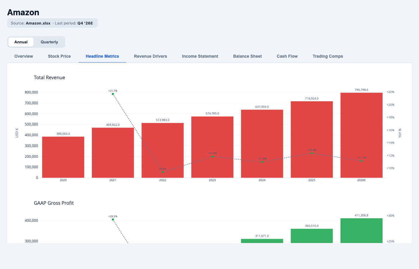
"Total Revenue": [386064, 469822, 513983, 574785, 637959, 716924, 796799],
"periods":       ["2020", "2021", "2022", "2023",  "2024", "2025",  "2026E"]
Step 4 is rendering. The JSON data is baked into a self-contained HTML file. Each metric becomes a Plotly bar chart with a YoY growth rate overlaid as a dotted trendline. The dashboard has an Annual / Quarterly toggle at the top — switching it swaps every chart to the other granularity simultaneously.
What you can see that Excel hides
The visual format makes three things easier.
The trendline overlay on every chart shows acceleration and deceleration at a glance. In the headline metrics view, you can see Amazon's gross profit compress in 2022 and then recover sharply through 2023 and 2024. In the quarterly view, the compression is visibly front-loaded in Q1 and Q2 2022. That pattern takes several minutes to find in a spreadsheet. In the dashboard, it is immediate.
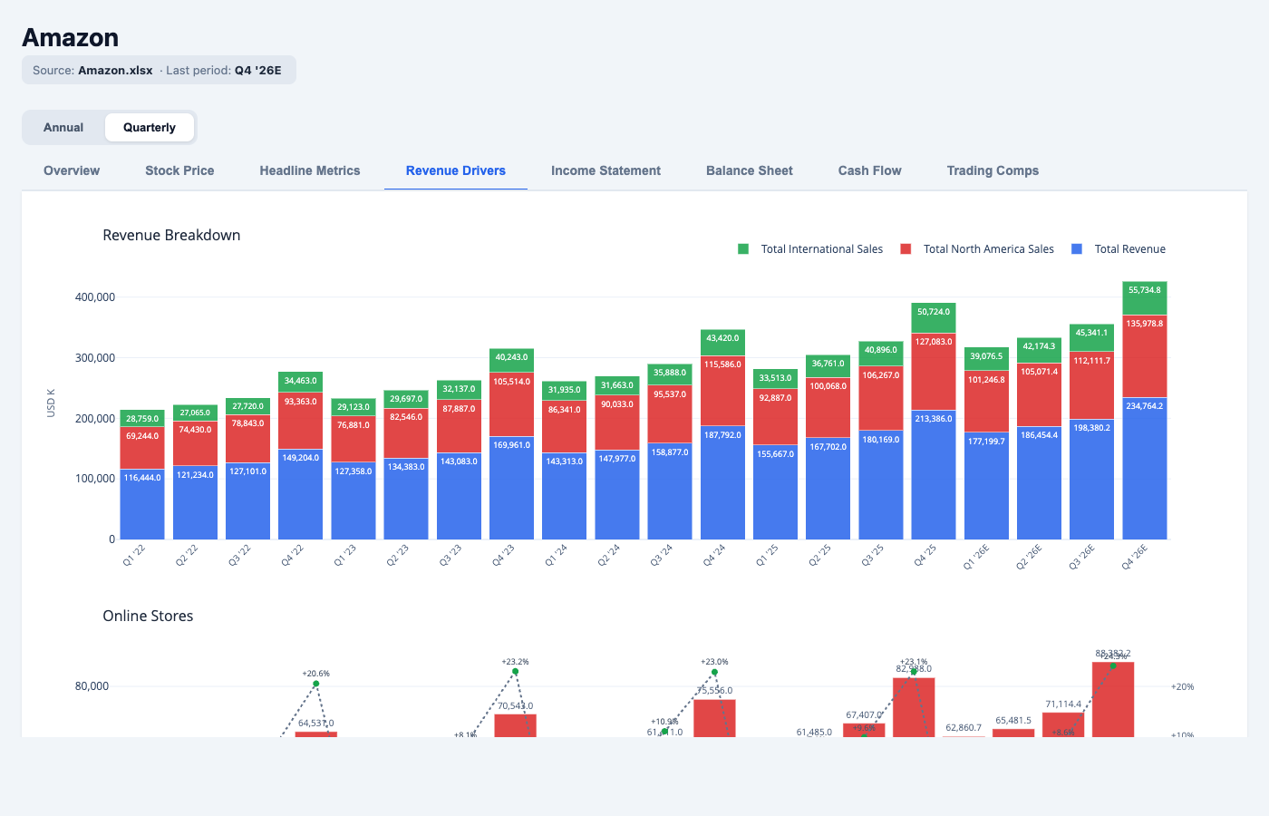
The quarterly toggle surfaces seasonality that annual figures smooth over. AWS growth in the quarterly view shows a consistent acceleration pattern from mid-2023 onwards. The retail business shows clear Q4 spikes. The advertising segment has been growing faster than both, with very little seasonality — which is itself a signal about the nature of that revenue.

Different model cuts are fast to produce. Because the data lives in JSON and the dashboard is generated from a schema, you can ask for a different view — a segment breakdown, a margin compression chart, a capex-to-depreciation ratio over time — and get back a new chart without touching the Excel file. The model itself stays clean. The analysis layer sits on top.
The output
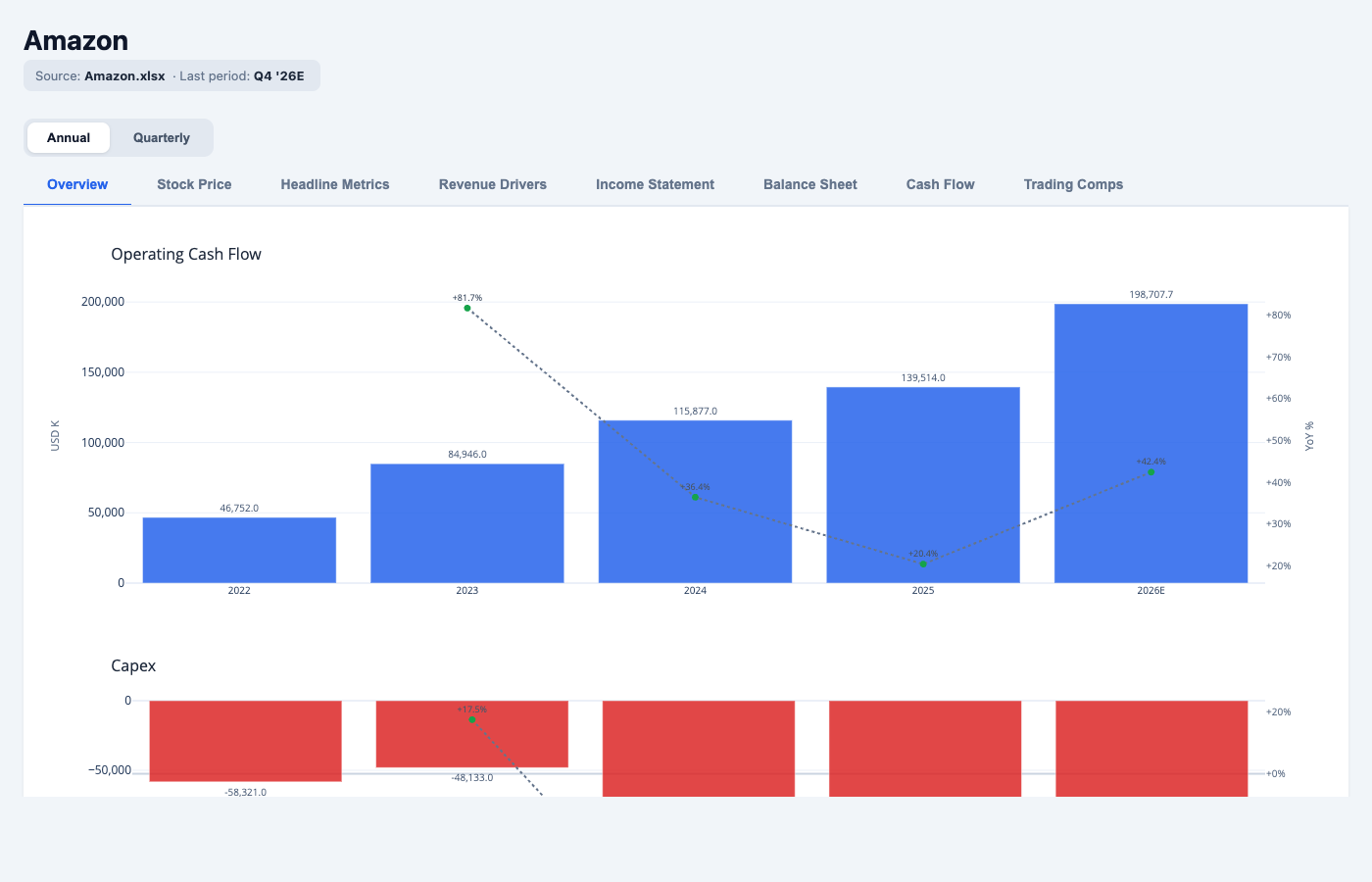
The result is a single dashboard.html file. It has no server dependencies. You open it in a browser, or send it directly to someone else. Plotly renders live — you can hover for exact values, zoom into a time range, or hide series from the legend. The tabs cover Revenue Drivers, Income Statement, Balance Sheet, Cash Flow, and Trading Comps. Each respects the annual / quarterly toggle.
The Excel file is not modified at any point. Finny reads it, extracts from it, and leaves it alone. The workspace saves the schema, the JSON data, and the dashboard — so the analysis is rerunnable if the model is updated with new actuals.
What changes when you work this way is how quickly you get to the question that matters. The structure navigation disappears. You start reading the numbers instead.
Run this on your own models
Every dashboard in this post was generated from a single command: /review-model. Point it at any Excel financial model and it produces the same interactive output — tabs, trendlines, annual and quarterly views — for your own companies and datasets. It is part of finny, my financial analysis skill set for Claude Code, and it is free to use.